The recent announcement of ClickDimensions’ acquisition of marketing dashboard leader Sweetspot has many ClickDimensions customers asking, “What is a marketing dashboard?” or “How would a marketing dashboard benefit my marketing efforts?”
Data is often called the oil of the digital economy. However, you can collect all the data in the world but if it’s not actionable data, it will be useless. Proper visualization is crucial to be able to act on data and make data-driven business decisions. The need to map actions against objectives and have a holistic view of all data in context is evident for different user roles, including marketers, managers and analysts. For marketers, a well-designed and accurate marketing dashboard is the most powerful ally in our everyday work.
Defining Marketing Dashboards
Marketing dashboards are a specific category of marketing analytics software – purpose-built for the marketing department – that provide easy, on-demand access to analyze and optimize campaign and channel performance data while providing a clear view of marketing’s impact on revenue. A marketing dashboard is a key item in modern marketers’ toolkit to face the ongoing challenge of maximizing the success of a brand within the assigned budget. Think of it as a compass or as a guide. Looking at the bigger picture, it is a core part of the enterprise data warehouse and business intelligence strategy.
A digital dashboard is a single piece of truth visible for the whole team, empowering marketers to say goodbye to tedious manual reports and takeaways presented in Excel or PowerPoint. Another remarkable benefit of automated reports is that they not only save a considerable amount of time, but they also enable marketers to detect patterns and invest more – both effort and money – in what works well. At the same time, marketing teams can adjust and rethink what doesn’t bring the expected results.
Another great advantage of marketing dashboards is the customization. You can adjust the structure of the dashboards, the amount and the name of the tabs. Logos, colors and images reflect the brands’ corporate guidelines. Additionally, each user can personalize notification settings. They can choose whether and how they want to receive messages when being mentioned or replied to; if they prefer to see it on the online platform or mobile applications.
With regards to data governance, the configuration options enable marketers to decide which users or groups are able to access certain dashboards. Imagine that some reports are shared across the entire organization, but a few financial summaries are confidential and only shared with a limited set of users.
Marketers work with multiple data sources that all need to be connected and displayed in a unified look and feel. It’s time-consuming and inefficient to deal with these pieces of siloed information separately. Thanks to codeless integrations and intuitive interfaces, having all the data in the same place is not a show stopper anymore. Data from websites, blogs, paid advertising campaigns, social media platforms, your CRM and more is all available for analysis and reporting in the same platform.
How are Marketing Dashboards Structured?
Think of a marketing dashboard as a cohesive unit. According to reporting best practices, it requires a hierarchical visual structure. Typically, the information is displayed in a structure that reflects the following order of importance:
A high-level textual summary, or a takeaway, to kick off with a captivating headline that provides users with the most primary information at first glance. The most effective dashboards include constructive human insights and recommendations to prompt action.
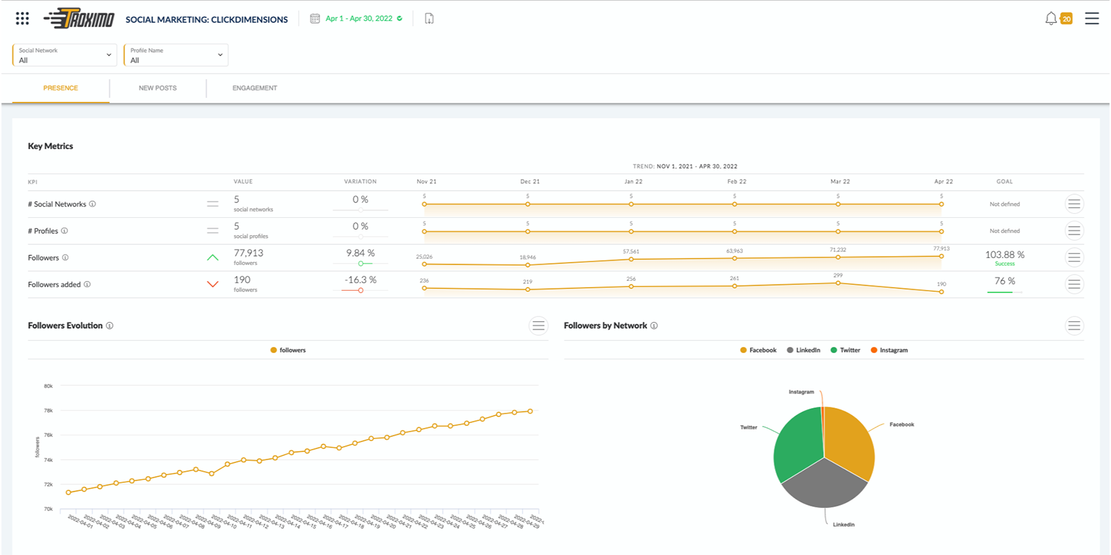
This will be followed by the most significant strategic KPIs at the top of your dashboard. Such elements immediately tell you WHAT is happening. KPI values on their own are not sufficient to see the whole picture. Goals tied to these KPIs are fundamental. If they are defined and tracked appropriately, you will see your progress towards them. The presented data will be easier to interpret and you will be able to react in a timely manner, if the situation requires action.
Next, supporting context is needed. This could be in the form of charts and/or tables, which allow users to explore their metrics and understand WHY things are happening. It will help you detect trends, patterns and anomalies.
Lastly, if there is any additional information you are contemplating to include, ask yourself whether it adds further value or insight to what you have already presented. In an affirmative case, either placing it at the bottom of your report, or attaching it as a downloadable document or link would be a good choice. Keep in mind that this is an optional element, not a must-have. That is, it is only added when it brings significant value.

During the design stage, it’s important to think as if you were the end user. An excellent marketing dashboard is in balance, including all critical information and leaving the unnecessary out. A marketing dashboard is committed to providing the most valuable information possible. In summary, it turns information into insights.