
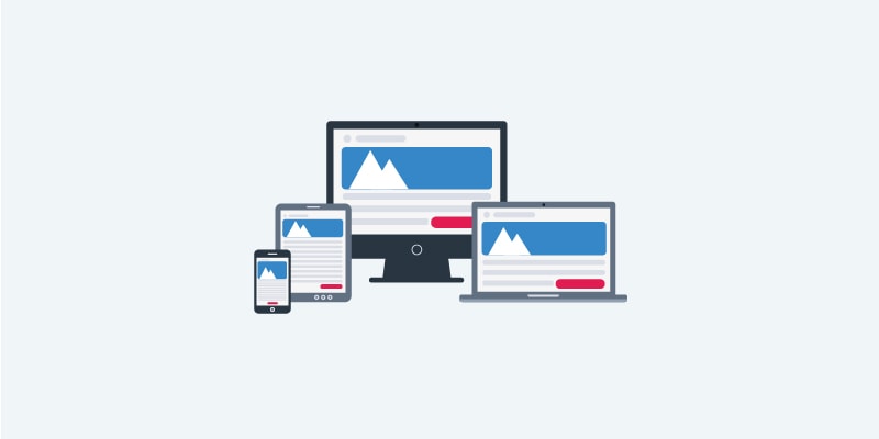
As consumers increasingly move to mobile for more of their communication needs, designing emails for different sized screens becomes increasingly important. A responsive email is an email that is optimized for any device, including a phone, desktop or tablet. Responsive emails adapt to multiple screen resolutions with full functionality, allowing for recipients to read on their preferred device without missing out on content.
Designing an effective responsive email begins with working to create a better experience for your recipients. Ideally, marketers aim to create a responsive email that both looks great and increases conversion rates. Here are some tips for achieving exactly that:
1.Think mobile first. Every time you send an email it is important to remember that an increasingly large portion of your readers are going to open your message on their phones or tablets — not on their desktops or laptops. Considering this, designing with a mobile first mentality is vital. It’s important to not only get your emails opened and read, but also to make your recipients’ reading experience as effective as possible. Using a single column layout will simplify your design and highlight your important content. A one-column format is easily legible whereas two or more columns will crowd a small screen. In addition, carefully consider your fonts. The standard main body font type for a responsive mobile email should be between 14-16 points and between 22-24 points for headlines.
2.Keep your call to action front and center. Many of your recipients will likely glance at the top portion of your email messages and subconsciously make a snap judgement about whether the content is scroll worthy. You have a small window of opportunity to grab your recipients’ attention and inspire them to act. The positioning of your call to action (CTA) will play a key role in determining where your readers’ focus is directed. Make sure to include a CTA near the top of your email to ensure users never miss it, even if you repeat a variation of it towards the bottom. This helps to increase the scanability of your emails while also drawing attention to your main message or offer.
3. Short and concise subject lines. Increase your email open rates by crafting subject lines that subscribers simply can’t resist. According to a study by Litmus, shorter subject lines between four and 15 characters in length achieve the highest open rates, while subject lines with more than 50 characters have the lowest open rates. This is likely because longer subject lines get cut off on mobile devices. A typical desktop inbox displays up to 60 characters of an email’s subject line, while mobile devices show just 25-30 characters. Use that small character count to intrigue your recipient while also conveying a sense of what they will find inside the email.
4. Condense the content. To create an effective responsive email design, it is crucial to keep your content short and concise. On mobile, your recipients are often on-the-go and easily distracted. This means they don’t have time to read large amounts of text. Create consumable chunks of content (i.e. bulleted lists, short paragraphs) that are short and scannable. This makes it easy for your reader to digest your content and understand the key action they should take with your email message. Get to the point ASAP if you want to get to the customer at all.
5. Give thought to your images. Images are a great way of making your emails more dynamic and attractive. However, in responsive email design, images can be your worst enemy when chosen incorrectly. It’s important to choose an appropriate image size. Using overly large images runs the risk that your emails will not display properly or that they will take longer to load. Overly small images will not deliver better results either, delivering distorted or pixelated images.Also, be prepared for your images not to load. Not all mobile devices display images by default, so it’s best to plan for an “images off” experience to ensure your email will still make sense. If your image doesn’t load, readers will only see ALT text. This will allow readers to understand your message, even without images. For this reason, always use a balance of text and images in your email.
Responsive emails are key to helping your messaging remain relevant to your on-the-go audience. These five easy-to-implement tips should help you on your way to creating effective responsive emails that readers are more likely to open and act on.
Happy Marketing!
