Forms are an important channel through which organizations engage customers online and can sometimes be a customer’s first impression of your business. A well-designed form lets you gather information from your customers while presenting them with a positive user experience. But a poorly designed form can cost you data and reputation by frustrating customers or causing them to give up on the form entirely. Poor user experience design on your forms can impact their accessibility across different devices and user types as well as the quality and quantity of submissions.
Follow the eight tips below to enhance user experience on your forms and keep your customers happy.
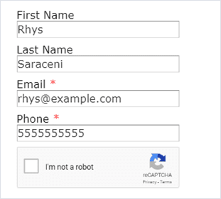
1. Prepopulate fields to do the work for your customer. Getting a customer to your forms can be an adventure in and of itself, so the last thing you want is for them to give up on the form because they are being asked to type out information that you should already have on record for them. That’s where ClickDimensions’ profile management feature comes into play. Setting up a form as a profile management form allows you to dynamically prepopulate fields with data from the customer’s CRM record so they don’t have to take the time to type it in themselves. This also has the added benefit of letting them correct the data if something you have on record is no longer accurate.
The process for prepopulating a form varies depending on whether it is linked directly from an email or embedded on another page, so be sure to check the linked articles for instructions on how to manage each scenario.
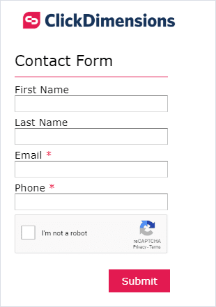
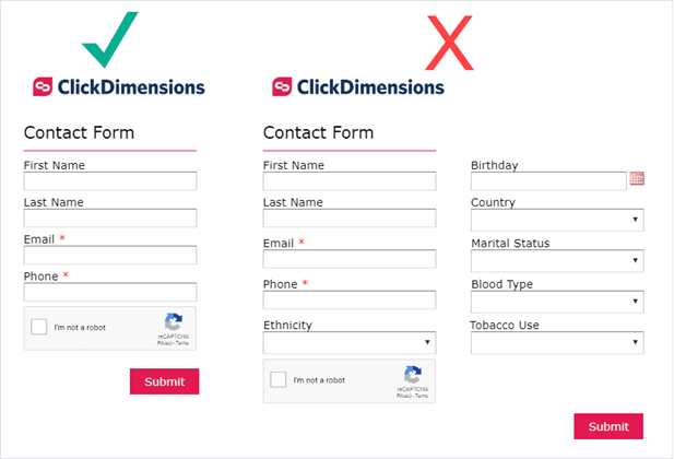
2. Use a one column layout. The ClickDimensions form editor allows users to include up to three columns in their form if necessary. However, sticking to one column is generally best. Limiting your form to one column makes it legible to your customers and allows them to easily progress from field to field with their Tab button rather than manually moving the mouse and clicking each field.
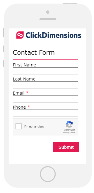
3. Keep mobile users in mind. An ever-increasing number of people are using their phones to read emails and access online content, so it is essential that your forms are still easy to use on a phone’s smaller screen. ClickDimensions forms are mobile responsive, so if your forms aren’t already a single column, they will automatically be updated to display in one column if it is accessed on a mobile device. That is only half the story, though. You will also want to design your form to ensure that the text is legible on a phone screen and that all fields and buttons are distinct and large enough to be easily clicked by the user on a touch screen.
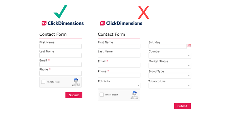
4. Only include the essentials. As much as you may want to know the name of your customer’s childhood pet, their birthday or their new favorite restaurant, it’s in your best interest to limit your form to only essential information. Including too many fields on your form can stress your customer or cause them to lose interest in the form, hurting your relationship and causing you to lose out on valuable information.
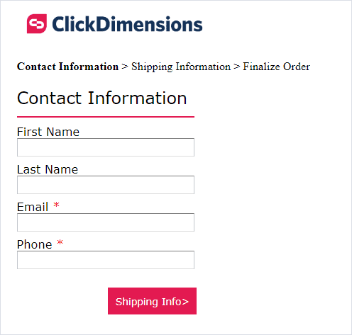
5. Split longer forms into multiple pages. Sometimes you must ask for a great deal of information from a customer, even if you are only asking for the essentials. If you need to request a lot of information, but that information can be easily split into subcategories, like order information and shipping information, you may want to consider splitting your form into multiple pages using the ClickDimensions form editor’s Page Break component. This will help keep the form design cleaner and avoid overwhelming the customer by displaying too many fields at once. Just be sure to use clear verbiage on your buttons between pages to make it clear to the customer that there is more than one page to the form.
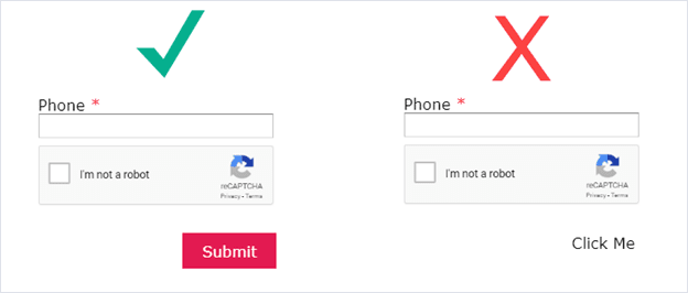
6. Make buttons and their purpose obvious. Whether it is the submit button or buttons used to move between pages, make sure that your buttons are styled so that they are obviously buttons and the customer immediately understands what will happen if they are clicked. The default button text and styling convey these points well, but if you need to modify the buttons to better align with your company branding, keep in mind attributes like the button background color, border, font choice and hover state to ensure that the buttons are still clear to your customers.
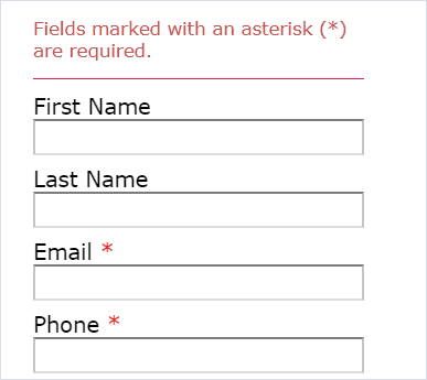
7. Distinguish between required and optional fields. This is an easy point to implement. Whenever you mark a field as required in the ClickDimensions form editor, we will automatically add a red asterisk next to the field name to denote that it is required. This syntax is widely used, but If you really want to make the distinction evident to your customers, you can also add an HTML or Section Title component to the beginning of the form to add a note specifying that an asterisk means that a field is required.
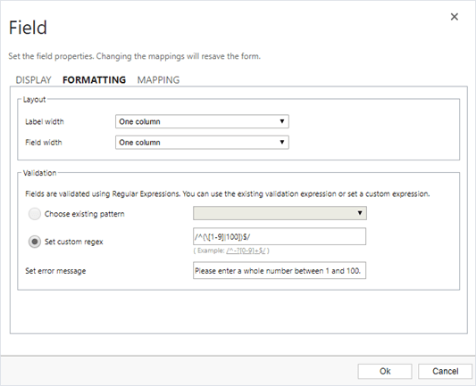
8. Use clear error messages. Most types of form fields in the ClickDimensions form editor include validation settings where you can place restrictions on the types of data that the field will accept. If you choose to use this feature, be sure to use the included error message field to provide the customer with clear, concise feedback regarding why the data they tried to put into the field is invalid or specifically what type of data is necessary.
Taking these guidelines into account will help leave a positive impression of your business on your customers and make them more likely to conduct business with you again in the future. A positive user experience leads to happy customers, and happy customers leads to a happy business.
Happy Marketing!