

There are many factors that make up a compelling design, and color is arguably one of the most important ones. Although it might seem simple, sometimes picking out the right colors to use can be a daunting task. With so many options to choose from, how do you know where to start and what colors will work well with others? To help guide you, here is a quick overview of color theory.
Color Theory 101
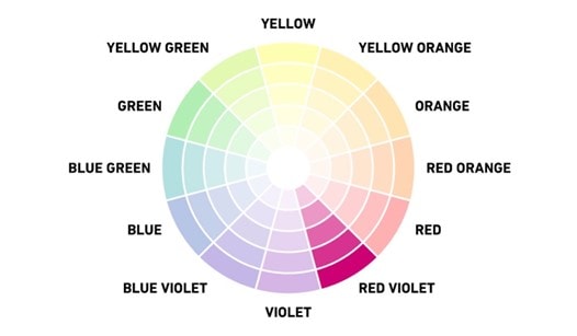
Before picking out colors to use in your design, it is good to have an understanding of basic color theory. Here is your basic 12-step color wheel:
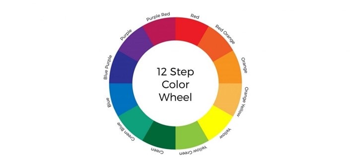
The basic parts of the color wheel are as follows.
Primary Colors:
These are colors that cannot be created by mixing two colors together. Think of these as your parent colors that can anchor your design in a general color scheme.
The primary colors are:
- Red
- Blue
- Yellow
Don’t feel like you are just restricted to the above three colors, though. For instance, one of ClickDimensions’ brand colors is known as Cranberry, which is not a primary color. Knowing which primary colors are used to make the color Cranberry, however, is helpful in figuring out what colors will work well with it. This brings us to our next type of color.
Secondary Colors:
These colors are made by combining two primary colors. In the color wheel above, they fall between each of the primary colors.
The secondary colors are:
- Purple (Blue + Red)
- Orange (Red + Yellow)
- Green (Blue + Yellow)
Keep in mind this only works when combining the colors in their purest form, also known as their hue, which we will look at later in this article. Next, is our third type of color.
Tertiary Colors:
These colors are created when you mix a primary color with a secondary color. In the color wheel above, they fall between the secondary and primary colors.
The tertiary colors are:
- Magenta (Red + Purple)
- Vermillion (Red + Orange)
- Violet (Blue + Purple)
- Teal (Blue + Green)
- Amber (Yellow + Orange)
- Chartreuse (Yellow + Green)
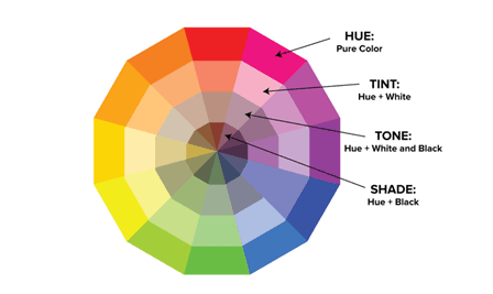
Now that we are familiar with the “main” colors of the wheel, we will briefly go over hues, tints, tones and shades. As we all know, there is a much wider range of colors to choose from than the 12 covered above. To get these other colors you can mix white, black or gray to create brighter, lighter, softer and darker colors. Here are the color-related terms you need to know:
Hue: Hue can pretty much be used interchangeably with “color.” All your primary and secondary colors are hues.
Shade: Shade is often used to refer to how light or dark a version of a hue is. A shade is technically created when you add black to a specific hue.
Tint: Tint is the opposite of shade. Tints are created when you add white to a color.
Tone: Tone
is created by adding both black and white to a color.
Basic Color Schemes
In color theory, a color scheme is the choice of colors used in designs for a range of media. Using the main color schemes can be a great starting point when working on your design.
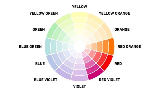
Complementary Color Scheme:
Complementary colors are those that are opposite on the color wheel. They are usually a primary color and a secondary color. When paired together, they provide high contrast, such as blue and orange.
Analogous Color Scheme:
Analogous colors are those that border each other on the color wheel, such as red orange, red and red violet. “Analogous” means closely related, so these hues have a harmonious appeal and are known to be aesthetically pleasing.
Monochromatic Color Scheme:
Monochromatic color schemes focus on a single color and often use variations of that hue by incorporating tints, tones and shades. These types of color schemes have been very popular in recent years due to the rise of minimalism in design.
Using these basic guidelines, you are well on your way to picking out the best colors for your project!
Happy Marketing!