Imagine you are looking at an advertisement with absolutely no text. Would you be able to tell what brand the advertisement is for based on the colors used? Color is a powerful tool that appeals to people’s emotions, more so than words and even graphics. It can create a positive or negative experience. Some of the most successful brands on the market today have become synonymous with the colors they use, not just in their branding but in other visuals as well. Here are a few tips so you too can effectively use colors in your designs and amplify your marketing message.
1. Start with a color you like. This may seem obvious, but sometimes people tend to overthink things when starting a design. Oftentimes, if you are stuck on what colors to use, the best plan of action is to begin with a color you like. From there, using your knowledge of the color wheel and color theory, you can build a color scheme that fits together and is visually appealing.
2. Save your color schemes. Whenever you create or find a color scheme that you like, it is always a good idea to save it so you can reference it easily later. You don’t have to do this for everything you design but sometimes you will be able to pull colors from different schemes later on.
3. Maintain consistency. Branding is always important when it comes to creating marketing materials. In order to keep your brand recognizable to your audience you want to be consistent in what colors you use in your designs. For example, T-Mobile’s signature color is a bright pink and it is featured in almost all their marketing, from their advertisements to their web design. Now when a consumer sees that color, they almost instantly associate it with their brand.

4. Understand color psychology. Color can be used to convey different meanings in your design. For example, blue is associated with the sky and feelings of calmness while red is associated with passion or even anger. When you understand the psychology behind certain colors it becomes easier to choose which ones you want to use based on the intent of your design. You can find a handy chart here to help with your selections.
5. Develop a strategy. Developing a color strategy will help with making decisions about which colors to use for specific things. For example, maybe all your call to actions are the same color or your text is always the same color. Sticking to this strategy can help you decide what other colors to use in a particular design and can also keep you consistent.
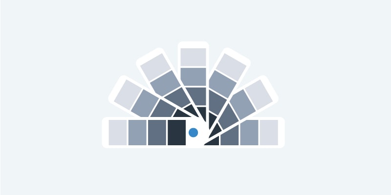
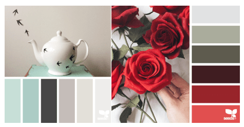
6. Seek inspiration. Choosing colors can easily become overwhelming. So, sometimes it is good to look for some inspiration before starting on your design. Sometimes inspiration can come from stepping away from your screen and actually looking at the world around you. Design Seeds does a great job of this by pulling together color palettes from things in the natural world.
Other great resources include websites like colorpalletes.net and Adobe Color.
Happy Marketing!