

Marketing
5 Ways to Improve Your Presentation Design
by clickdimensions

The COVID-19 pandemic has had a major impact on how people and businesses operate. With social distancing guidelines in place and many companies continuing to follow work from home policies, people are relying more and more heavily on digital communication. Virtual events have become a popular, necessary and effective tool for businesses to engage with customers. That means having a great looking presentation has become even more important. Here are five tips on how to make a great presentation that will keep your audience focused and engaged.
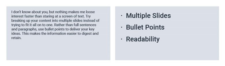
1. Keep it simple. I don’t know about you, but nothing makes me lose interest faster than staring at a screen of text. Try breaking up your content into multiple slides instead of trying to fit it all on to one. Rather than full sentences and paragraphs, use bullet points to deliver your key ideas. This makes the information easier to digest and retain.
2. Mind your fonts. If your font is too small, no one is going to be able to read your words and your message is going to be lost. As we discussed above, using bullet points allows you to increase your text size, making things legible and clear. Not only is the size of your font important, but the style of it is key as well. Decorative and script fonts might seem like a good idea to make your presentation more interesting but a lot of times these are hard to read. Instead, enhance your slides using color or images. Keep your fonts clear and classic.

3. Don’t go overboard with color. As I mentioned above, color can be a great way to add visual interest to your design, but you want to make sure you are not using so many colors that it becomes overwhelming. A good rule of thumb is to stick to four or five colors and use them consistently across slides. Another thing to keep in mind is contrast. Picking font colors and backgrounds that contrast with each other is a great way to make sure text stands out. For instance, white text on a dark background is going to be clearer than white text on a light background.

4. Make use of images and icons. A great way to break up text is to use icons. Icons work well at taking concepts and reducing them to simple shapes. Many people are visual learners, so icons can help them understand and remember the information in your presentation. Images are also a good way to add some visual interest. Keep in mind to use imagery that is in line with your branding. It is really easy to go overboard with stock photography, icons and graphics, so make sure use them sparingly on your slides so as to not end up looking cluttered.

5. Don’t forget about white space. White space, or negative space, is simply the space between text, images, graphics and blocks. White space allows the reader to rest their eyes between pieces of information, allowing them to more effectively process your presentation content. If your slides have too much text or too many images, it is hard to know where to focus your attention. This can cause people to zone out and lose interest, which is the last thing you want when giving a presentation.

Happy Marketing!

Related Resources

5 Easy Steps to Launch Your Employee Advocacy Program
The key to launching a successful employee advocacy program is planning ahead. This step-by-step guide is based on our experience helping hundreds of B2B marketing teams get social advocacy [...]

3 Internal Teams That Shape Social Media Marketing Success
Here’s a great business debate for you: which department within an organization should own social media? Marketing may immediately come to mind, but what about customer service or sales? [...]

5 Reasons You Should Survey Your Customers
Asking questions is an essential part of how we all learn and grow. This is as true for businesses as it is people. And it is the root of [...]

