

Marketing
5 Design Tips for Creating Engaging Infographics
by clickdimensions

In a world where people are being constantly overloaded with information, it can be hard for marketers to engage audiences. To add to marketing challenges, individuals are increasingly seeking information in more visual forms. Fortunately, infographics are a great way for brands to deliver content in an engaging way. Infographics are visual representations of information, including data, timelines and even helpful tips.
If you are new to infographics, their design might seem a little tricky. But there’s no need to fear because we have a few tips for making your infographics look their best.
1. Use more images than text. Due to their informational nature, infographics will always contain some amount of text. It is important, however, to keep that text short and concise. You want to support your graphics, not overpower them. Instead, try to think of visual ways to represent your information by using charts and graphs or icons and illustrations to present points. For the text that is in your infographic, read and re-read it and ask yourself if every word is necessary.
2. Use complementary images and colors. Few things are more visually distracting than a bunch of images that look nothing alike and don’t follow any sort of brand style. Even if you are making an infographic with a particular theme, it is important that your visuals be cohesive. For example, our holiday marketing infographic uses illustrations throughout that are similar in look and feel. The infographic’s color scheme not only incorporates colors from the ClickDimensions brand color palette but also includes complementary ones that support the overall winter wonderland theme.
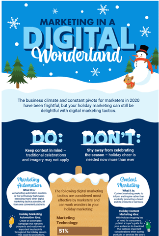
3. Be mindful of white space. As we have covered, visuals and text are essential components of an infographic, but white space is another important factor. White space is any unmarked area of the page that balances out your design. The eye often needs room to “breathe” and that can be hard when there are too many elements crammed together. Keep in mind that white space doesn’t necessarily have to be white – it can be any background color that you choose to use. In the below example, the white space is actually navy in some sections and light gray in others. Notice how the graphics and text are separated out to make everything clear and visually appealing to the eye.

4. Watch your length. While you want to be informative, keep in mind that an infographic is not the same as a white paper. If your design seems like it is going on forever, you might need to remove some text, rework the visuals or rethink the topic – or a combination of all these things. You want to keep people’s attention and an infographic that is too long runs the risk being boring, causing people to lose interest halfway through. If you have too much content and are unsure of what to cut, try breaking up the information and data into a series of infographics instead of just one.
5. Keep it simple. This might be one of the most important tips to keep in mind when designing your infographic.
We have all seen infographics that are so complex and packed full of images and text that they are hard to decipher. It is important to keep your text and visuals purposeful. Your infographic should convey your information in the simplest way possible. Limit the number of fonts, colors and images to keep clutter to a minimum. The audience should be engaged not confused by your infographic.
Happy Marketing!

Related Resources

5 Easy Steps to Launch Your Employee Advocacy Program
The key to launching a successful employee advocacy program is planning ahead. This step-by-step guide is based on our experience helping hundreds of B2B marketing teams get social advocacy [...]

3 Internal Teams That Shape Social Media Marketing Success
Here’s a great business debate for you: which department within an organization should own social media? Marketing may immediately come to mind, but what about customer service or sales? [...]

5 Reasons You Should Survey Your Customers
Asking questions is an essential part of how we all learn and grow. This is as true for businesses as it is people. And it is the root of [...]

